ALBERS'ISMS
February 16, 2001
Josef Albers was a German-born man who studied art in Berlin.
In 1920, at age 32, he enrolled at the newly-formed, progressive
Bauhaus school in Weimar. (The Bauhaus, a design workshop formed
by architect Walter Gropius, was "dedicated to merging
the traditionally separate disciplines of the fine and applied
arts in an effort to improve the quality of modern life in all
its aspects and, ideally, at every social level. At the Bauhaus,
the design of a teapot was as important as the architecture
of a building, and the craft of furniture making as serious
an undertaking as mural painting.")
He was one of the worlds most important color theorists,
and his body of work has a certain distinction that reflects
the talent of a meticulous researcher. He explored color shifts,
values, contrasts, repetition, and relationships. He developed
new ways for the viewer to look at his works, as he forced
his viewers into a changing and dynamic relationship, rather
than having them accept one visual truth.
Throughout this course (and maybe all color theory courses),
we too were guided to explore color relationships and tonal
values. Vasa's assignments had me look at values more so than
some of my past professors, who were infinitely more "artsy."
But, he cared greatly about the hues we used, and let us know
in his heavily accented way that we're all so familiar with.
"This just doesn't look good, chose better colors."
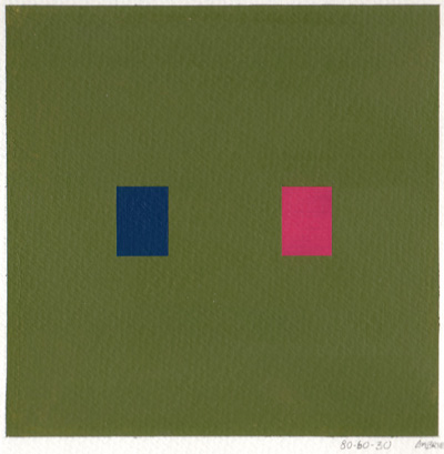
Done with masking tape and acrylic on watercolor paper.
We've all been through these boxes. This assignment
was a 40, 60, 80. We paint two colors,
one with a value of 40 percent, and one with a value of
80 percent, on a background that's 60 percent.
In the new and (cheater) digital world, there's
an easy way to check your values. Just look through the
LCD of a digital camera on a black+white setting.
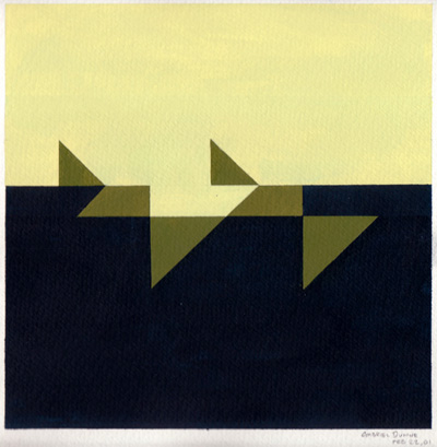
Another similar assignment, also acrylic on watercolor
paper. This was a 20, 50, 80. The 50 percent
valued color will appear to change, depending on its background.
The triangles are all the same 50 percent value.
Things got weird when
he allowed us to use our computers. I was among the few
that desperately wanted to resist the use of Adobe Illustrator,
as our colors would never turn out the same as our acrylics.
However, the majority rules, and it allowed people to
go crazy with their letters and shapes and colors. It
gave me incentive to make a statement about the technology.
I went minimalist, and thought about painting during critique.
Computers have a tendency to blind your eyes from a colors
true hue and value. Generated light glowing from a screen
is much different than reflected light, and I'm not sure
if Vasa even realize this. I think that a digital color
course should be introduced as a standalone, and restrict
the other color theory courses to paints and
masking tape.
|
|